From a new Eames design to the Poor Things set, is this the hottest colorway?
I think so, but I asked an aura reader to find out why.
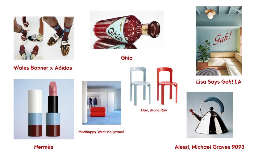
This is going to be niche, but this week’s newsletter is curated entirely through the lens of this colorway:
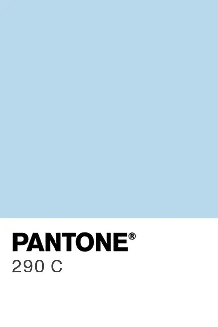
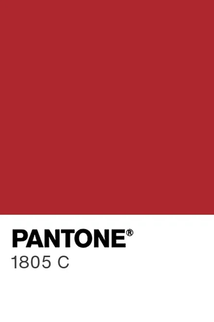
I’ve been trying to pinpoint the moment my obsession with powder blue and dark red began and I honestly don’t know. I do know that once I proclaimed it as my favorite pairing, I began to notice it everywhere, both around my own home and out in the world, and yet it doesn’t feel overplayed.
Some might call this the frequency illusion or the Baader-Meinhof Phenomenon, but I choose to declare it as powder blue and red becoming the hottest colorway (ever?).
I should mention, that it is also the colorway for gr8 collab’s branding, selected after I came to terms with this fixation, which makes me smile every time I see it.
A series of personal powder blue and red encounters from recent memory:
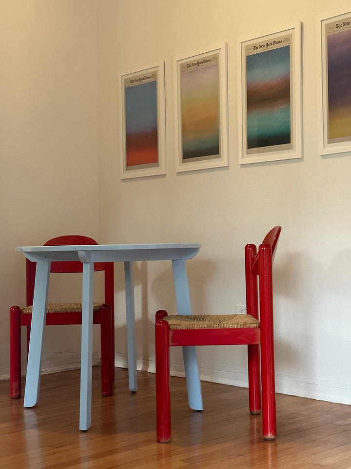


I DIY painted a $30 dining table I bought on FB Marketplace in Behr’s Soft Cloud. Then my friend Abby tipped me off to a pair of red 1970s Hank Loewenstein Padova chairs. I picked them up from the vintage dealer two days later and now it’s the happiest corner of my home.
Sometime in the fall, I went to get my nails done wearing this blue Ganni cardigan I wear so often, it sometimes feels like my security blanket. A friend had just told me about the ‘red nail theory’ and I needed to test it out. I came home and realized I matched the dining room.
On Christmas, I saw Poor Things in theaters and spent half of the movie taking bootleg pictures to research the set design (culminating in this TikTok), including the red and blue checkered drapes in the cruise scenes that I still think about.
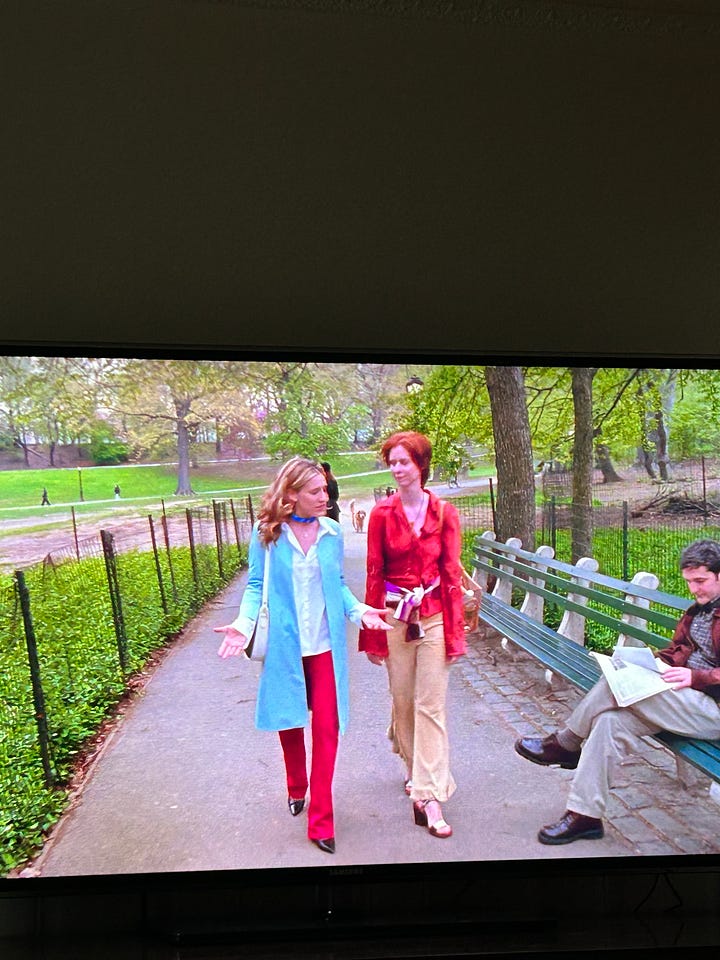
I spoke to my sister about this colorway recently and she on the spot airdropped me a picture she took while watching Sex in The City of Carrie and Miranda walking through the park in red and blue ensembles.
All of this begs the question, are the best things in life blue and red?
I think so, but let’s talk about some examples outside of my personal life…
From brand land
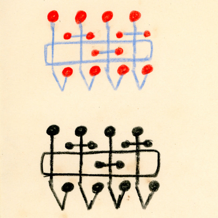
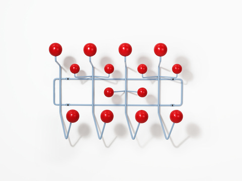
I’ve been making a point to jot down brands I wanted to feature in this letter for over a week now. And then on Wednesday, I caught a new launch from Herman Miller by way of Amy Auscherman, MillerKnoll’s Director of Global Archives and Brand Heritage (she co-authored this Herman Miller book!). Everything else I was going to tell you about has to take a backseat now– this is a design(ish) focused newsletter after all.
There’s a new Eames Hang-It-All colorway on the block. Color has always been an important part of the Eames brand given Ray Eames’ early career as a painter. Inspired by the colors used in her original sketches for the design, in this iteration, the steel rod frame is powder-coated in stonewash blue, and the wood ball hooks are painted bright red and it launched this week (right in time for this letter) and it’s really good. If I didn’t already own the OG colorful one and if gr8 collab had an office, I’d be buying it.
And some other brand moments on my mind… what did I miss?
Spaces to lose sleep over
I’ve always been fascinated by the design of things made for children– I love the balance between practicality and playfulness where everything feels (and also needs to be) thought through. While I don’t have children, I’ve talked about interesting playground designs (here and here) and well-designed kids’ furniture on my TikTok, and have been known to tip my friends with kids off to great clothing brands.
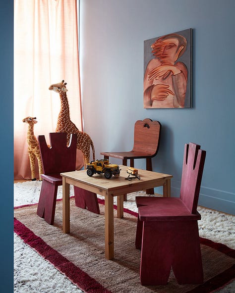
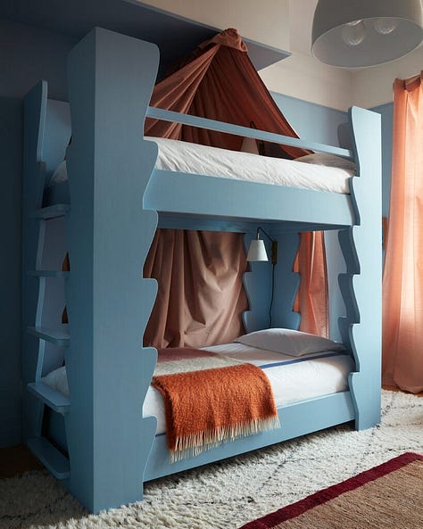
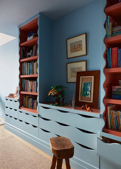
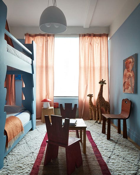
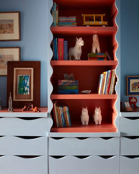
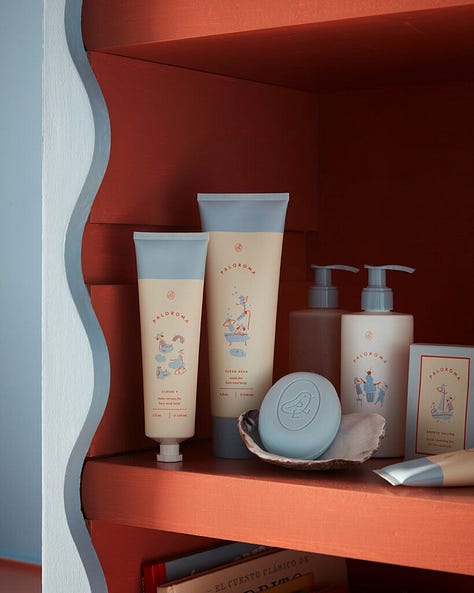
We obviously know and love Giancarlo Valle’s interiors and architectural work, but have you seen his own kids’ room in their Dumbo loft? I love this space because it’s both whimsical and also somehow sophisticated… dare I say it’s the color palette? It’s also a similar color palette to his wife, Jane Keltner de Valle’s, children’s skin-care brand Paloroma.
The chairs cost $4500 each, but that’s none of my business. If someone buys one, lmk.
There’s a really interesting Domino Mag article about this specific room and the feng shui master the couple hired thanks to pal, Tory Burch, whose recommendations led to the final design of the kids’ room.
A creative you should know
A few months ago Susanna Merrick reached out to me on Instagram with the sweetest note about my TikTok. She mentioned, “I see we’ve tagged each other in stories before but I can’t remember why.” I thought for a second, and then I knew– I had featured Susanna on This is Twenty, nearly four years ago. It was the universe (or the algorithms) bringing us back together and when I started thinking about this newsletter topic around color, I knew I had to get Susanna on the line for another interview. She’s an aura reader and stylist based in NY.
Tell us about applying your ability to read auras to your work as a stylist?
Your energy field (aura) is a direct connection to Y-O-U!
By learning the basics and complexities of your aura and how colors affect your energy, you learn to understand yourself, your wants, and your desires on a whole new level. And by taking the time to dress to match your energy you're magnifying the possibilities and outcomes through the law of attraction.
Our wardrobe is more than just a collection of clothes; it's a reflection of our innermost self, our aura. Being intentional about what you wear is not just about fashion; it's about expressing yourself and feeling confident. By allowing your wardrobe to become an extension of your aura and being mindful of your clothing choices, we not only elevate our style but also align our external appearance with our internal energies. When I created Aura Wear it was a no-brainer for me, the connection has always been there, I just simply pointed it out.
Is there a reason we are attracted to certain colors over others?
Color is a living, breathing entity. It resonates, and moves, and its frequencies are incredibly impactful.
Colors are influencing us constantly, whether we are conscious of it or not. In the spiritual world, we use color intentionally (color magic) to connect with different energies for personal growth, healing, and manifestation. For me, it’s the internality we put into color that creates big shifts. But there is a reason you feel drawn to some colors over others. We all have color intuition and we subconsciously want to feel the energy of that color in our aura, I just ask you to go even deeper with it and use it to color its full advantage.
Anything you can tell us about blue and red specifically?
Red and blue, while both primary colors are at the opposite ends of the visible spectrum are still often used together to create contrast. They’re also the two colors most often used strategically to evoke emotional responses as well as a likely combo for design. Red is always attention-grabbing while blue gives us a feeling of trust and reliability so it is a marketing color match.
Where do you look to for inspiration?
Each week I designate a blocked-off day of work to “go do market research” aka- have some alone time while I have childcare. I love to go to different neighborhoods and people watch, last week I sat outside a cafe on the Upper East Side, one of the neighborhoods I’m least familiar with despite living here almost 20 years… I watched the older ladies dressed for their outings and studied their outfits, some wearing vintage un-ironically and I wondered what the back story was, when did they buy it? What was going on in their life that Moment they bought their all-green scarf?.. The story in my mind was endless.
I also love thumbing through TikTok Tok looking at Portugal ‘it’ girls' fashion vlogs. Nothing they put together makes sense and the chaos intrigues me. As a mom, I crave structure but long for the days when chaos only existed in my closet and my love life. I think that’s why I can’t look away, I’ve put together style guides for my clients recently that were heavily inspired by my scrolling, and have felt inspired to shift things up in my own closet.
Shoutout a brand, space, or creative on your mind.
Last year I met the coolest mom at the park in Ridgewood, she was wearing a floppy Fendi sun hat, cut-off jean shorts, and Hermes sandals, I loved her style as it reminded of my own, I’m never afraid to wear my nice things out with ‘play clothes” it’s like having a good candle and never burning it, anyway- we bonded, she told me she “drew things” Turns out she was CJ Hendry.. An artist I have been obsessed with for years. She recently opened a chain of indoor place spaces that we have lived at this past winter...
Where can people find and follow your work?
Check out my website and take my aura color quiz if you want to learn more about your aura.
I also host a handful of virtual aura readings each month and offer virtual and in-person styling sessions. I'm also on Instagram @aurawearnyc and TikTok @aurawearnyc.


add @Long Live to the blue and red top hits list!
this is SO good and made me realize ive been wearing this colorway unintentionally all the time? it never made sense to me because i always stray away from “patriotic” vibes but it being powder blue makes so much sense. brb sending u pics on ig 🤭